
How do we revitalise and modernise Eve’s packaging design and visual identity to strengthen its distinctiveness as a premium brand catering for women in carefree moments?


The Challenge
Eve needed to bring its brand story, ‘the pleasure that unfolds’, to life through packaging and a visual identity that celebrates spontaneous, positive moments.
The brand risked feeling dated, losing relevance with its audience, and missing the opportunity to attract a new cohort. The challenge was to revitalise Eve’s identity ensuring it stood out in the carefree space without alienating loyal customers while also creating a visual identity system that supports innovation and new launches.
In an increasingly competitive market, Eve needed a clearer, more compelling story to remain the go-to choice for great-tasting, carefree moments.


The Big Idea
Let The Moment Unfold
Eve is about embracing the here and now. It’s about unwinding, letting go, and enjoying life’s unplanned joys.
Eve celebrates a light-hearted, open-minded approach, where joy is found in real, unfiltered moments. It’s a drink for those who embrace whatever the moment brings. From its core offering to new innovations like the Secco range, Eve is designed to let fresh, carefree moments unfold for the next generation of drinkers.


The Solution
From Restricted Identity to a Story Unfolding
We developed a flexible yet cohesive brand system for Eve, designed to grow with the brand. It attracts new audiences while staying true to what existing fans love. Beyond the pack, we’ve brought these assets to life across all touchpoints, giving Eve a scalable, future-ready framework that can evolve with ease, year after year.
Introducing a new brand motif:
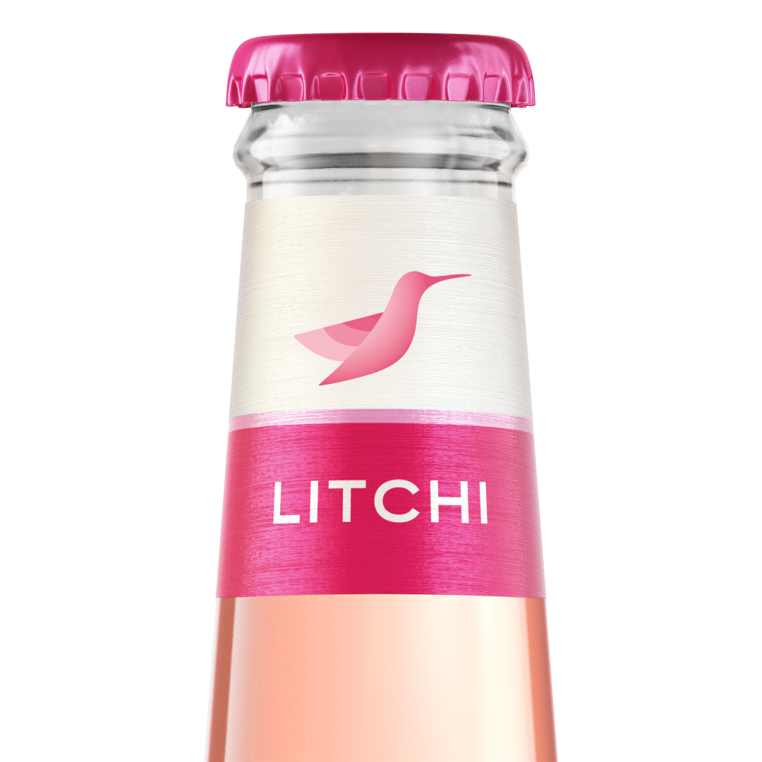
The Eve Hummingbird
To bring Eve’s brand story to life, we developed a suite of iconic brand assets that express spontaneity, joy, and carefree moments. This new visual language strengthens Eve’s storytelling, ensuring it stands out on shelf and resonates with its audience. We introduced a new brand motif, the hummingbird, symbolising Eve’s dynamic, vibrant, and free-spirited customers.


The Packaging
We brought the brand’s core idea ‘Let the Moment Unfold’ to life through a packaging system that bursts with flavour, energy, and femininity.
At the heart of the design is our signature unfolding device, flowing confidently across variants to evoke movement, vibrancy, and a sense of carefree spontaneity. It’s striking on shelf and elevates the brand’s modernity, while nodding to the open-minded, unconstrained moments that Eve invites women to enjoy.
The hummingbird icon makes its debut here, an elegant symbol of curiosity and exploration, guiding you into each moment with lightness and freedom. Paired with a refreshed, more crafted wordmark, the visual identity feels both contemporary and characterful.
Fruit cameos have been reworked to appear juicier and more refreshing, helping to cue flavour and refreshment at a glance. On secondary packs, the extended unfolding device creates strong brand blocking and powerful standout on shelf.


The Brand World
To create a truly distinctive brand world for Eve, we identified the need for assets that not only resonate with the brand’s essence but also help tell its story of pleasure and discovery.
The Hummingbird was created as a symbol of curiosity and excitement, playing a key role in driving brand recognition and guiding consumers to unexpected, delightful moments.
The Unfolding Asset was designed to visually represent the unfolding joy of a moment, capturing the essence of openness and connection. It flows naturally from the heart of an experience, spreading pleasure and building a sense of togetherness.
Together, these assets create a unique visual identity system that allows Eve to tell its story with authenticity, distinction, and a true sense of pleasure.


